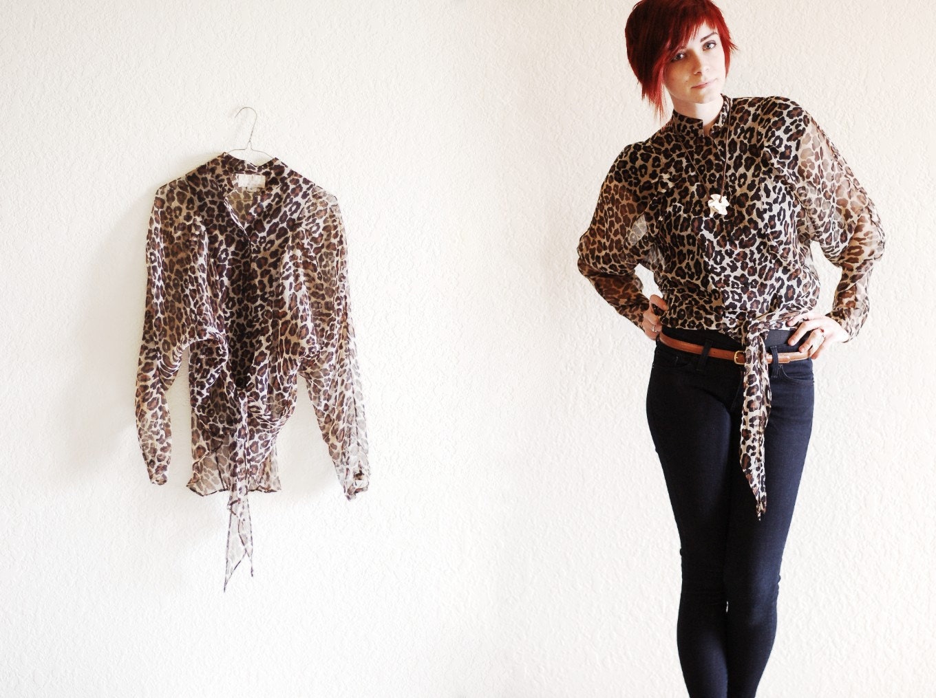
As a viewer, is this nicer to look at?

VS.

The garment will still always be shown on a person in the other listing photos for the sake of draping and fit, but I am curious if this is more appealing when initially browsing.
Please let me know! All feedback is extremely appreciated.
-Lily
EDIT: best of both worlds?


It is such a hard toss up I believe. I have a shop of my on on Etsy as well and have struggled with which idea I really wanted to go with. I really enjoy seeing the pieces on an actual person because it gives me that sense of style I am looking for. It is definitely cleaner when just on the hanger and I know exactly how you feel because I love that clean look that makes it easier to browse. I think you can definitely make either work! Depends on your style, look. I love the new look to your shop though, I take a peek quite often :) Here is my shop : http://www.etsy.com/shop/ChicOrigins
ReplyDeleteI'd prefer to be looking at the first. Simply because with photos of the item on a model, they'd have to be the same person in the same pose, otherwise it becomes a bit unorganised and weird. But even then, I'd still prefer to see just the garments and the photos with the garment on a model included on the product's page.
ReplyDeletewow-- tough choice! i like both :) but find the pictures with the actual model better for visualization purposes.
ReplyDeletexo
sami
ps. check out my print giveaway!
http://glimpseofglamour.blogspot.com/2011/04/love-ly-giveaway.html
I do think I prefer just the item as the main picture for browsing—it does look a bit cleaner.
ReplyDeleteI much prefer the item on a hanger. It just has a cleaner, sleeker, consistent look about it. I do agree that it's helpful to have it shown on a person too. You model the clothes very well.
ReplyDeleteThis is interesting to note because I've been saving some clothing for a online start-up shop. I was thinking I'd do a dressform, but the hanger is very appealing - I hope you don't mind if I copy just a bit. ;)
I think the top option is easier to look when the customer first logs on to your website page. Then when they click on the one that they like there should be a bigger image of someone wearing it so they would know how it would look on an actual person.
ReplyDeleteYes! The newer option is easier on the eye and more appealing as an online shopper.
ReplyDeleteLooks great!
Andrea
http:/andreas-7am.blogspot.com
Hope you follow back <3
As a shopper and blogger who writes about vintage, when I'm searching for inspiration, I prefer to look at stores who have their product on a person. That way I can see how that piece fits and the way it shapes on a person. Laying flat you can't really tell a lot about a garment as it has no dimensions or depth and as a result, to me, isn't as enticing to look at. On a person is when your garment comes alive and it catches the eye much quicker. Just my opinion though.
ReplyDelete